
Consistent voice, look & feel
All of your marketing materials need to be consistent in your campaigns. This includes your flyers, your business cards, your website graphics, your social media graphics, & your landing page graphics. If you are not consistent you are likely to see a “high bounce rate” people will fall out of your purchasing process when they notice an inconsistency or lose trust in your process. People purchase from trusted sources if you give them a reason to doubt you or mistrust you, you will lose out on a potential customer because they feel like they are being duped. Let’s look at a real Facebook Ad & Landing Page
Real life Example
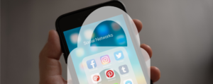
 Here we can see a real Facebook Ad as of 10-08-2017 from designrr an online software as a service for creating an ebook. you will see it has the logo, graphic, web address (to the landing page), and description of the product. This is a very simple ad, not a lot of flashy imagery or anything moving, it is straightforward and to the point. It lets us know we could create a PDF ebook without writing a single word appealing to our lazy nature to create something without putting in the work. Generally a good sales pitch, it even mentions a video on how to automate this process. Notice the copy, 90 seconds to create the ebook.
Providing this is something we are interested in and the ad was compelling enough to get us to click on it, we will then be taken to what is called a landing page, a page where we are provided with only one goal in mind to get us to order the product.

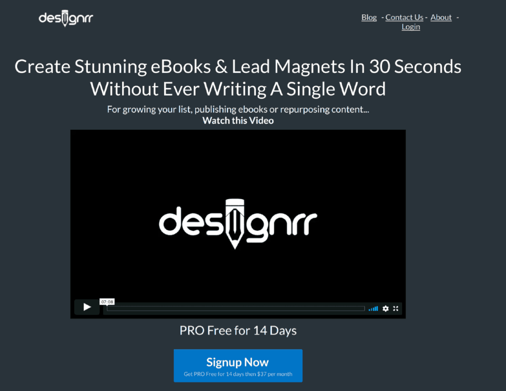
Here is an image of the landing page where we are taken once we click on the link. Notice we are not provided a navigation found on a normal website, yet on this page, we don’t have one. This is because when taken to the landing page we should only be giving one option to purchase the product. You will see the copy is similar as well remember the 90 seconds to create the ebook, notice it is repeated on the landing page, notice the purchase button, notice the video that was promised in the ad, notice at the top of the page where we are told this is a limited time offer creating a sense of urgency, notice that it would normally cost $324 per year creating value. All in all, this was a good written ad and landing page. How could we make it better? Using the same imagery on both the ad and the landing page. Using the exact copy on the page as we did in the ad are just two ways we could make it better.
Let’s take it a step further, take a look at the homepage for the service.
Here we start to see how you might be losing trust in this company. Now on the homepage, we see the claim that it only takes 30 seconds when in the ad it boasts 90 seconds, so which is it 30 seconds or 90 seconds? Notice it costs $37 dollars a month that is $444 per year if you recall the landing page said it was normally $324 per year. This brings to mind was the buy it button on the landing page for $27 dollars, a one-off charge or $27 dollars a month? I am not saying this is not a reputable company, I am pointing out how inconsistency could make you appear to be less than reputable. Later with some looking around, we find that this special deal is a deal that anyone can get at any time from there website and that the $27 dollars is a monthly fee, not a one-off charge. So at this point, the ad seems to not offer much of a deal and the claims do not match up, after watching the video we find that we don’t have to write “another word” to create this e-book, but we would have had to write at least one article if not many to make the e-book. So if you write a misleading ad, you are going to lose credibility with your customers and one misstep is hard to recover from as a small business.